Topics: Media + Advertising
In the current media landscape, attention is the ultimate currency. Recent biometric data confirms that the average window to capture a consumer's focus has dropped to a razor-thin 2.3 to 3 seconds. If your ad doesn't hit its mark in a flash, it becomes background noise.
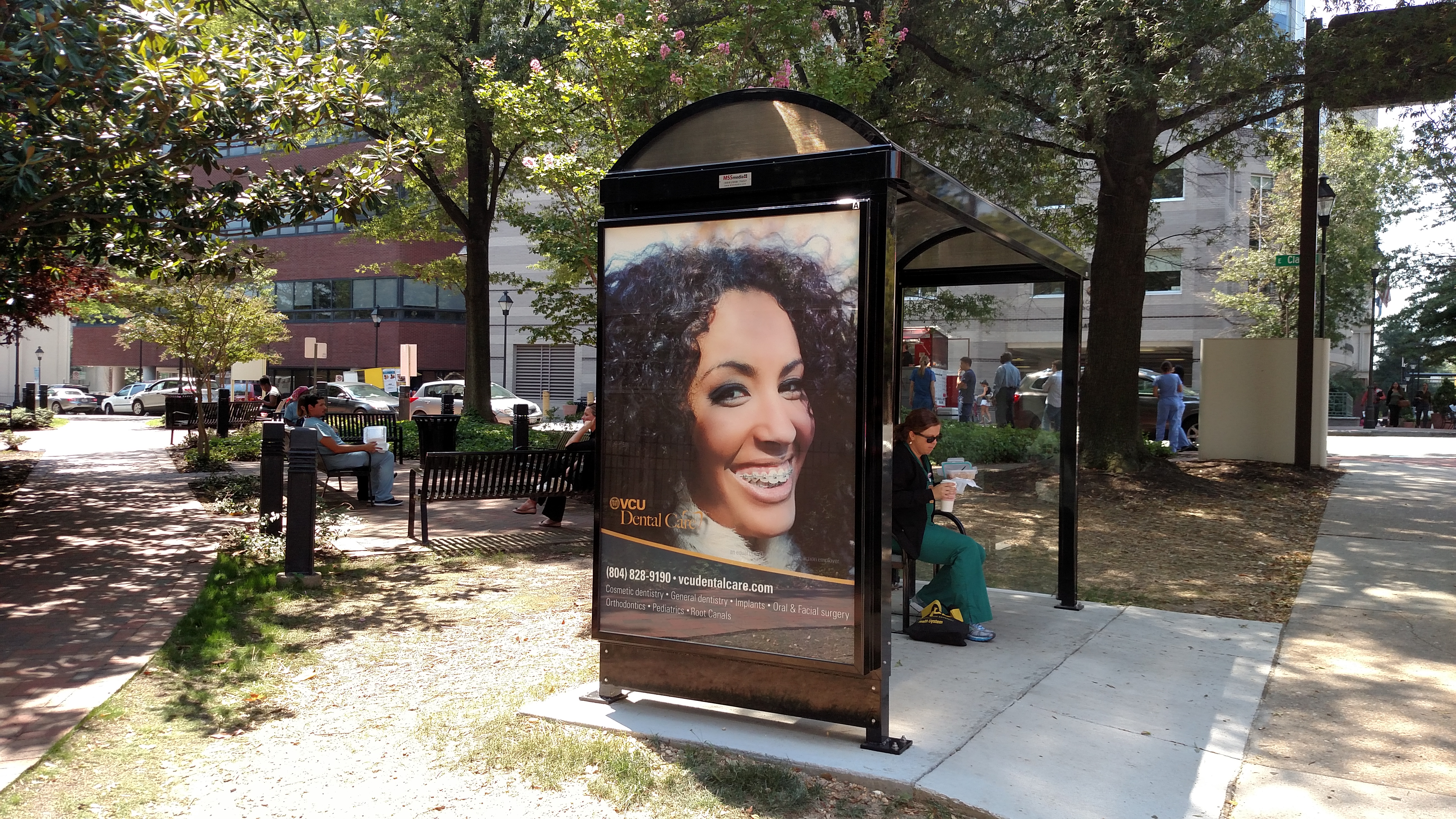
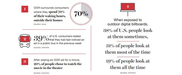
While online users can scroll past or skip digital ads, Out-of-Home (OOH) and Digital Out-of-Home (DOOH) advertising possess a distinct advantage: you can’t ad-block a transit takeover or swipe away a roadside billboard. However, physical unskippability doesn’t guarantee mental engagement. To win the micro-moment battle on the streets, brands must evolve their design frameworks.
Whether you are launching a programmatic highway campaign or a localized street-level activation, there are four essential OOH creative best practices to master the 3-second glance.
%2c%20shallow%20depth%20of%20field.jpeg?width=600&height=398&name=Two%20measurements%20of%20time%20White%20sand%20falling%20inside%20hourglass%2c%20with%20round%20analog%20clock%20in%20%20background%20(focus%20on%20neck%20of%20hourglass)%2c%20shallow%20depth%20of%20field.jpeg)
1. The 7-Word Rule is Now a 4-Word Goal
Traditional industry wisdom long preached the "seven-word rule" for billboard copy. But in a fast-paced environment where consumers scan rather than read, less is everything.
- The Strategy: Aim for a punchy headline of three to four words that delivers immediate emotional or conceptual value.
- The Layout: Let a single, hyper-focused visual do the heavy lifting of context, allowing the text to serve strictly as the hook or punchline.

2. Ruthless Visual Prioritization
Cluttered layouts are the death of ROI in DOOH campaign planning. When a screen features multiple product shots, a paragraph of text, social icons, and a logo, the human brain registers it as visual chaos and looks away.
- The Fix: Champion a single, dominant focal point. Use the rule of thirds to anchor your hero asset—whether it’s a striking product shot or an unexpected, high-contrast graphic.
- Embrace Negative Space: Give your design room to breathe. Empty space isn't wasted real estate; it is a visual funnel that directs the passing eye exactly where you want it to go.
“Make it simple. Make it memorable. Make it inviting to look at.”
– LEO BURNETT

3. High-Contrast Typography & Palette Execution
Function must dictate form when designing for viewers on the move. Color palettes that look beautiful on a laptop screen often fail completely when projected into real-world environments.
- Typography: Stick to bold, clean sans-serif fonts (like Helvetica, Arial, or heavy custom alternates). Avoid thin scripts or decorative serifs that blur at a distance or when viewed from a moving vehicle.
- The High-Contrast Advantage: High-contrast pairings are essential for readability. For example, black text on a yellow background achieves up to 95% legibility from a distance, while white on black reaches roughly 80%.
- Avoid Flat White Backgrounds: On modern LED screens, pure white backgrounds lack vibrant pop and can cause visual glare. Opt for deep, rich, or saturated background tones to make your text and product assets truly explode off the screen.


4. Context-Aware and Dynamic Creative
The most effective digital OOH advertising strategies leverage real-time environment signals. Thanks to programmatic automation, modern campaigns no longer rely on static, one-size-fits-all assets.
- Environmental Triggers: Program your digital assets to pivot based on localized live data streams—such as weather changes, time of day, or regional sports scores. A beverage brand displaying a steaming hot coffee graphic during a chilly morning commute can instantly switch to an iced latte visual when afternoon temperatures rise.
- Matching Dwell Time to Complexity: Match your creative depth to the consumer's environment. Roadside billboards require hyper-minimalism. Conversely, point-of-purchase displays, mall kiosks, and high-dwell transit hubs grant you the valuable luxury of extra seconds to utilize QR codes, short URLs, or deeper brand storytelling.
+ Learn more about the increasing measurability of OOH.
The 10% Branding Golden Rule
To tie your 3-second impression back to measurable business growth, ensure your brand identity isn’t an afterthought. Eye-tracking analytics reveal that placing your logo or brand name in the bottom right corner aligns perfectly with natural human scanning patterns, maximizing post-exposure recall. Ensure your brand assets occupy roughly 10% of the total design space—prominent enough to be instantly memorized, yet seamlessly integrated so it never disrupts the creative hook.
By pairing agile programmatic targeting with a stripped-down, high-impact visual strategy, brands can cut through the noise of the physical world and turn fleeting glances into sustained brand momentum.
Ready to maximize your OOH media impact? Contact our team today to build a high-performance, context-aware campaign tailored for your brand.
Here at MSS Media, Inc., we’ve been providing Education, Government, Real Estate & Lifestyle clients with succinct, optimized, and successful marketing solutions for more than 15 years. Consider MSS Media, Inc. a full-service, one-stop shop for all your Media and Public Relations needs. Your goals are our motivation. And our mission is to propel your message, further and faster, to achieve the outcomes you’re looking for. If you found this blog post helpful, please share!

+ Millennials + Gen Z